
Spring takes on mindful new hues

Echoes of Miranda Priestly’s famous “Florals? For Spring? Ground-breaking” quote comes to mind when thinking about the repetitiveness of Spring colour trends – but the season of 2022 is seeing a new, unexpected colour palette come to the fore.
Colour and paint trends are taking on a more emotional role than ever in the post-pandemic era. In tune with our new and heightened awareness of health and wellness, the effects of our surroundings and living spaces on our lives are of greater concern when it comes to interior design.
In the post-pandemic era, we have also entered into a new relationship with the earth, driven by a desire to connect with self, others and nature after spending so much time indoors. Yet the colours of Spring are less about recreating blossoming fields and more about capturing the sense of calm one feels in nature.
Introduce a contemporary mineral note into your home with a palette inspired by naturally occurring stones such as purple amethyst and reddish-brown jasper. Spring sees two quartz-inspired purples in the foreground: the mysterious Plascon Smoky Butterfly Bush (P2-D1-3) and the uplifting Plascon Crescent Moon (P5-D2-3). Once the pariahs of the interior design world, there is now a more welcoming attitude toward undertones of violet and purple, with both predicted to be dominant all the way through to 2023.
These mineral purples are taking cues from the vibrational quality and purported healing properties of crystals. Despite the ethereal aura of crystals, they are the result of chemical reactions happening deep within the earth – making this palette surprisingly grounded.
Plascon has also refreshed the classic black-and-white combo to suit a more mellow Spring. For a gentler monochromatic look, Plascon has paired off-black with off-white in the Spring Mineral palette with the softened and browned black of Plascon Ewa (72) and the warm grey neutral Plascon Ravine (62). Like their crystalline counterparts, the combo is very much of the earth.
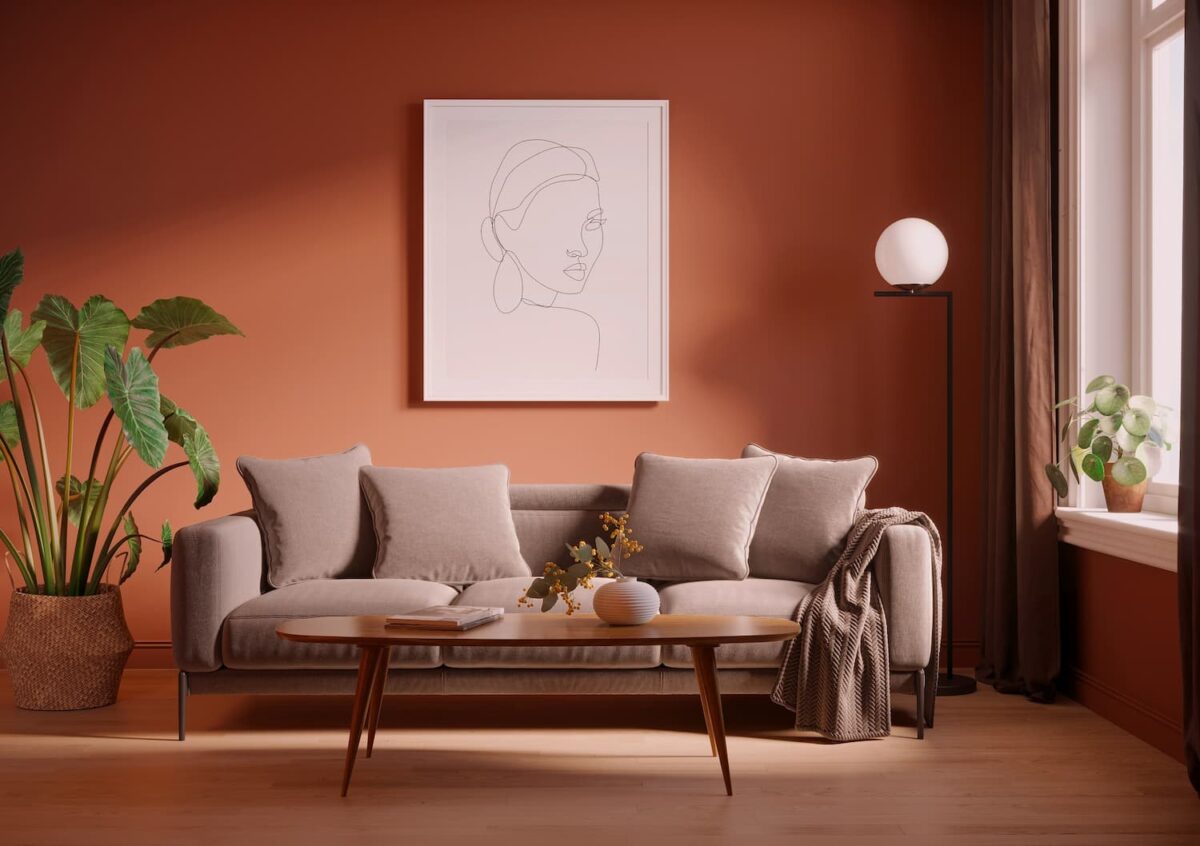
Rounding off the Spring palette, and providing a much-need accent of heat, is Plascon Ginger Biscuit (O1-C1-1). The use of orange in all its forms is fast becoming a trend for decorating homes and workspaces.
The forthcoming Summer season is also shimmying in with hues that evoke feelings of calm. The Celestial palette pairs two muted green hues, Graceful Green (G3-D2-2) and Nomadic Dream (56), a pastel periwinkle Desert Water (B5-B2-2), and two peach tones, Double Happiness (O4-A2-2) and Stardust Peach (O2-C1-3).